SUMMARY
MASLOW
User Experience design & Branding
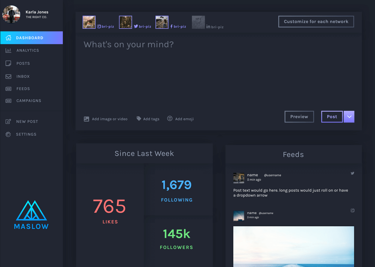
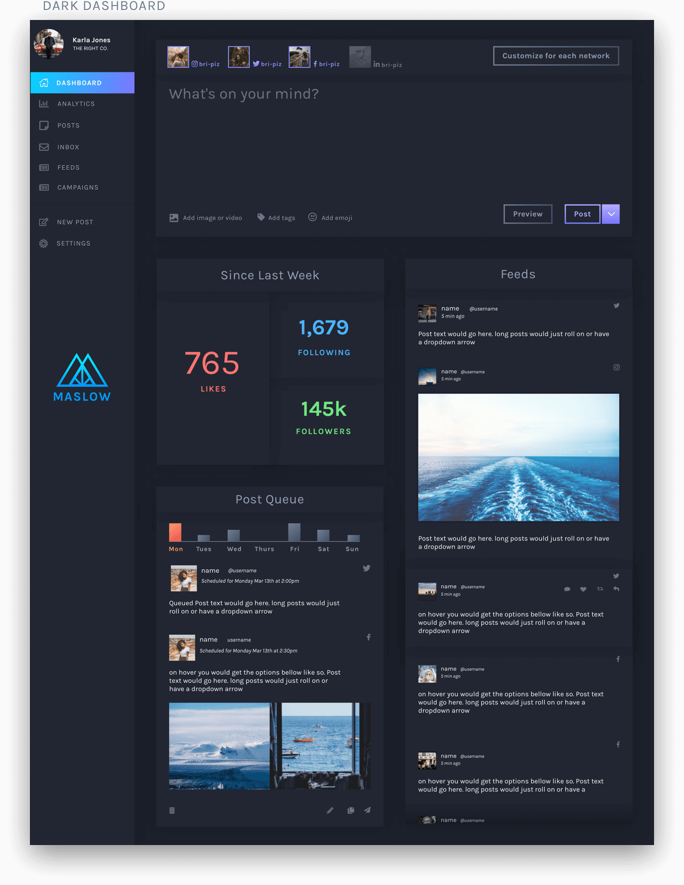
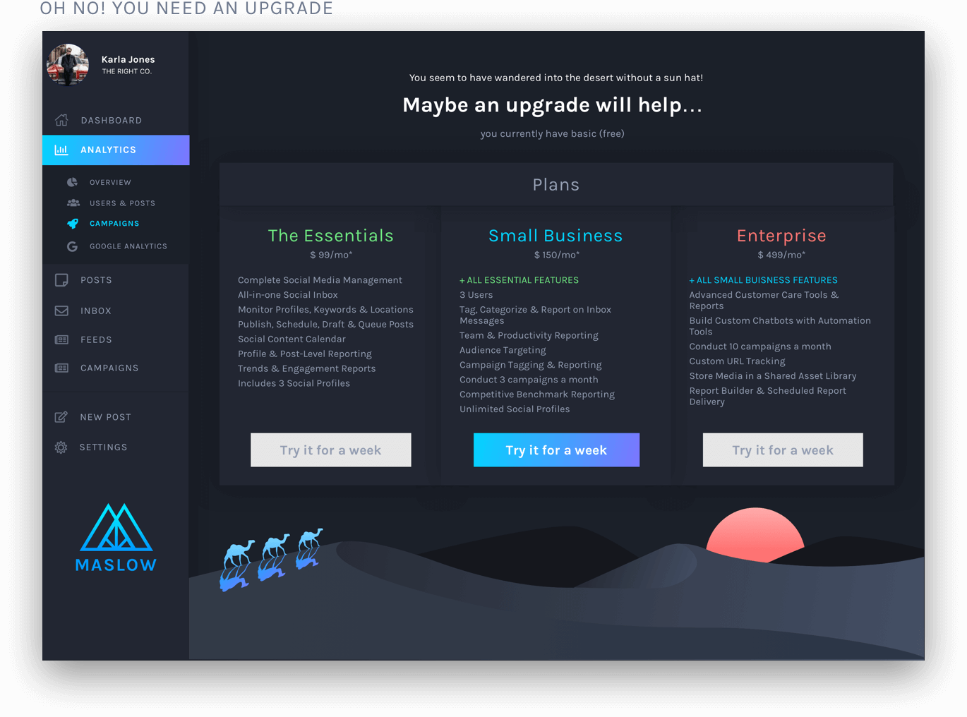
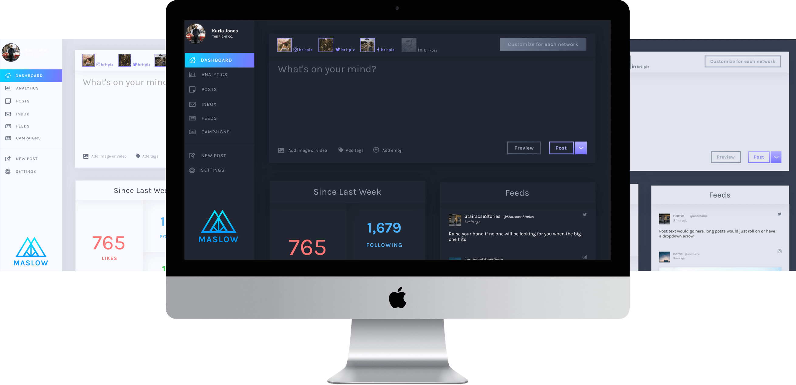
Maslow’s is an application that will simplify social media management for Small business owners and Influencers. Maslow does this by providing a centralized interface to all their social media networks and analytics for their scheduled posts, audience engagement, and advertising management.
Design Role
- UX Design
- Visual Design
- Branding & Identity
Deliverables
- User Surveys
- Personas
- User Stories & Flows
- Competitive Analysis
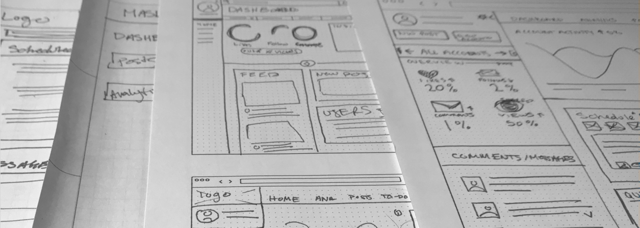
- Paper Prototype
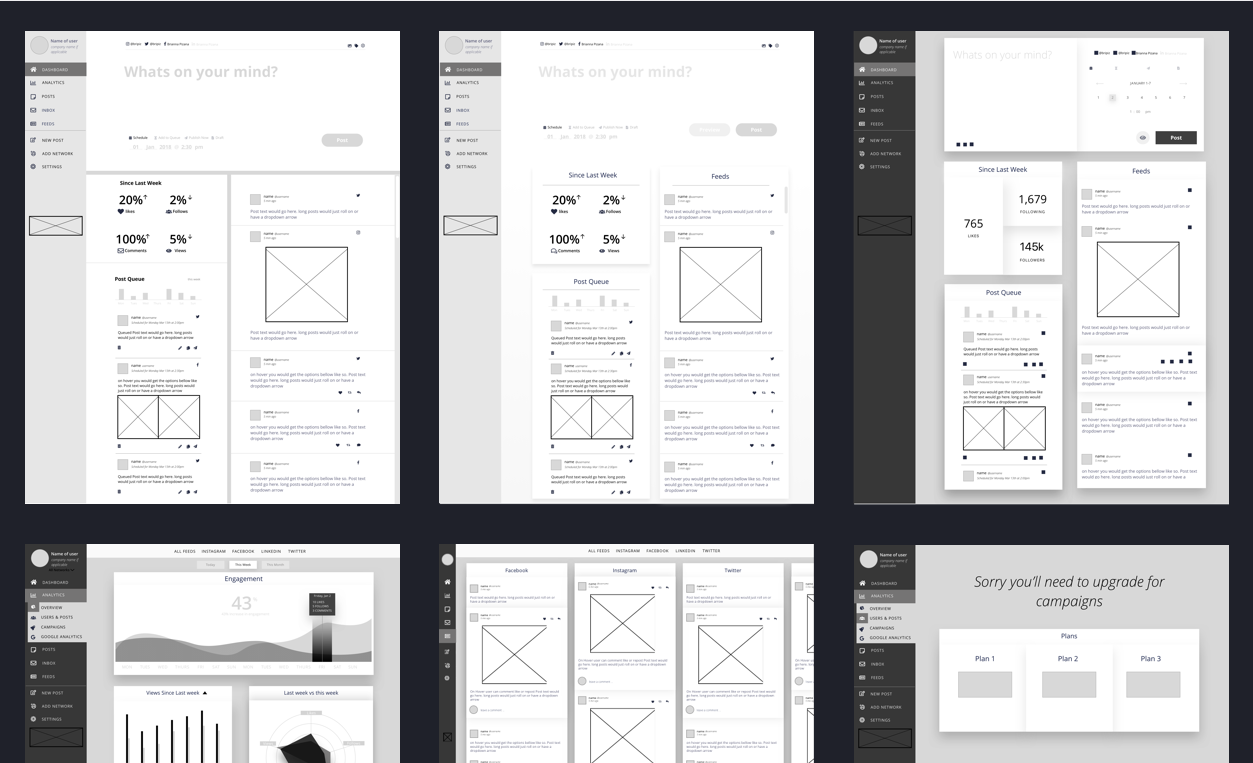
- Wireframes
- User Testing
- Visual Design
Tools
- Sketch
- InVision
- Photoshop
- Usability Hub
- Maze
OVERVIEW
Problems
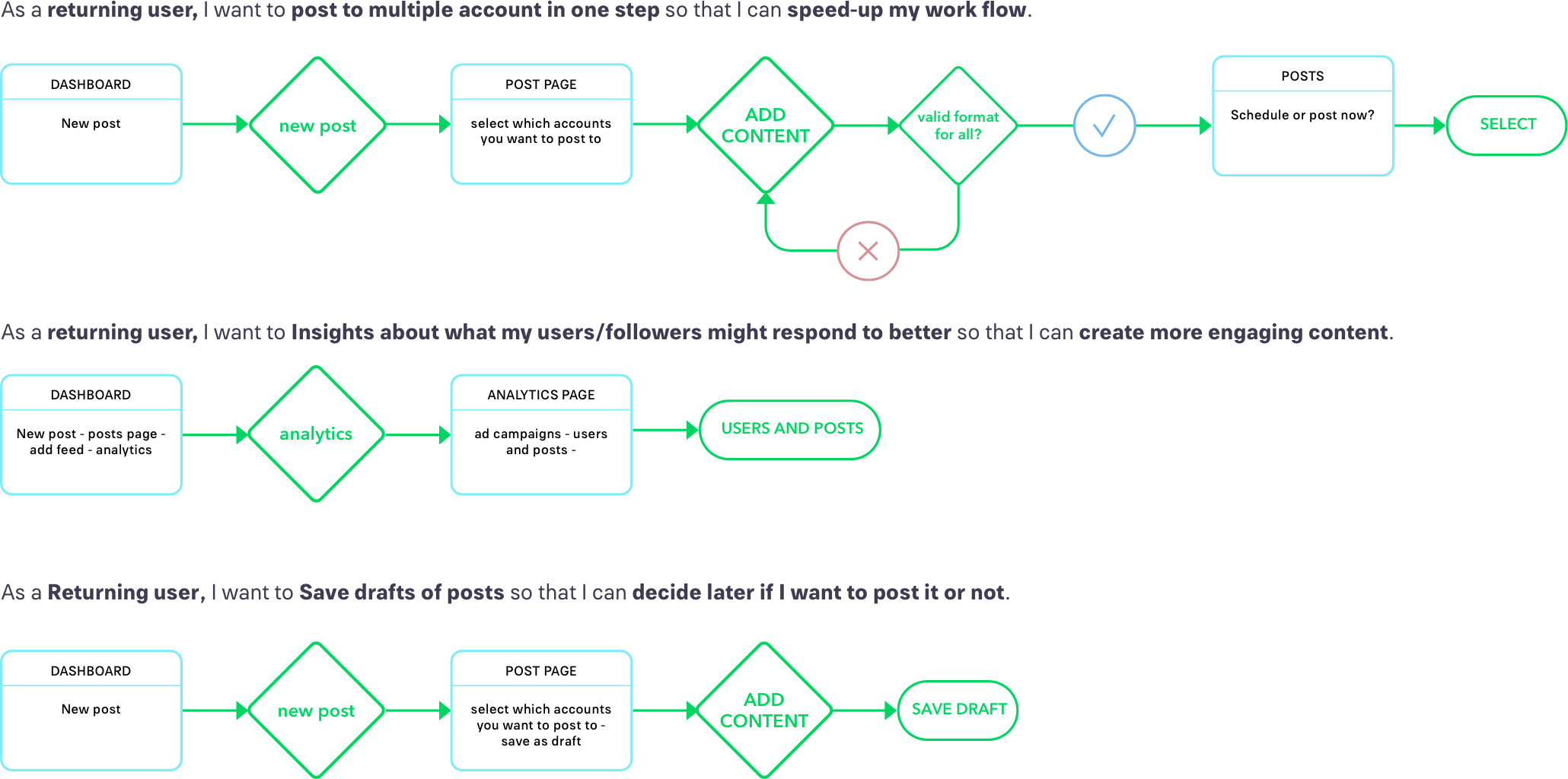
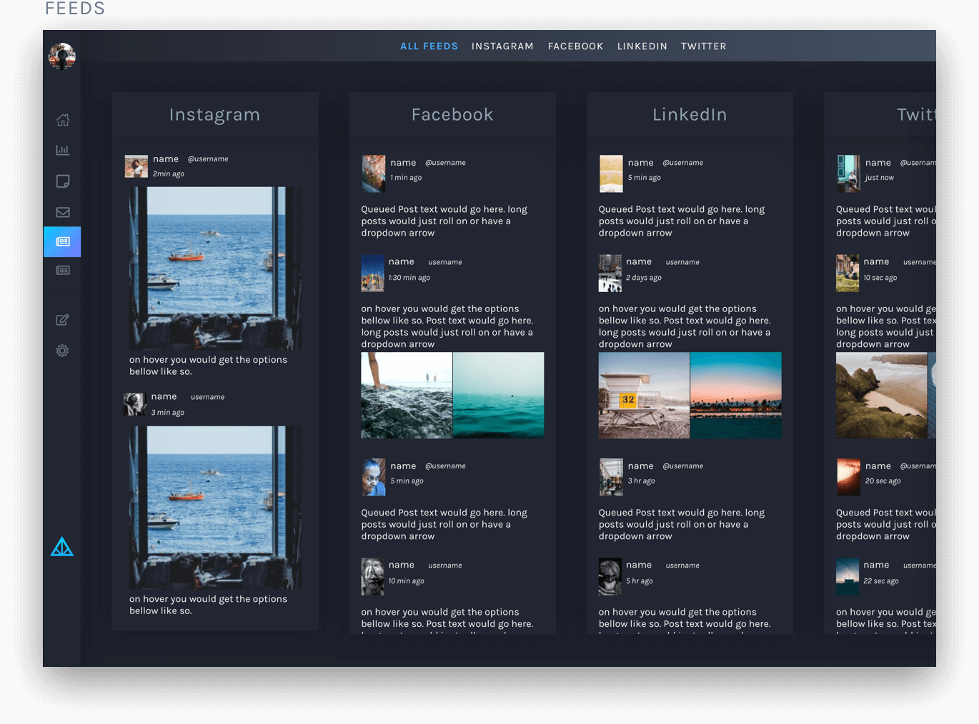
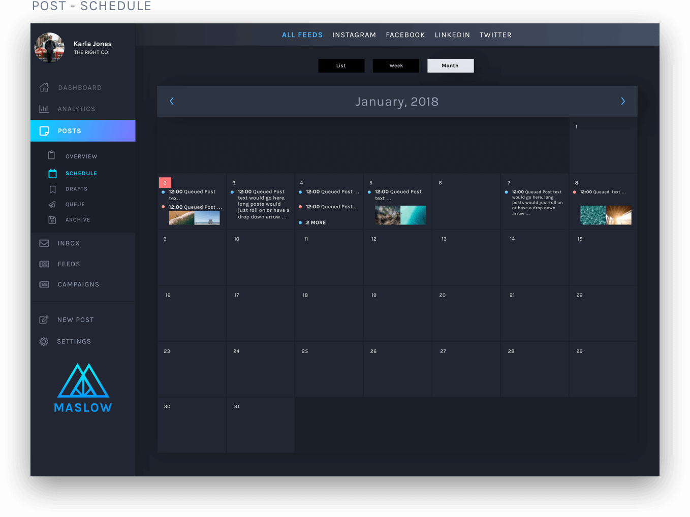
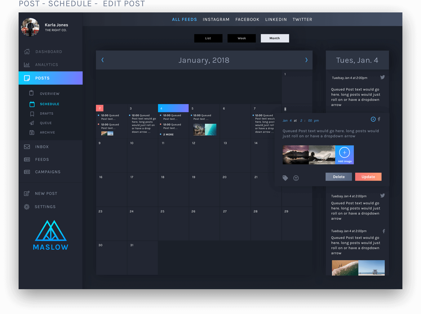
- 1. Users are required to go to each social media account to post.
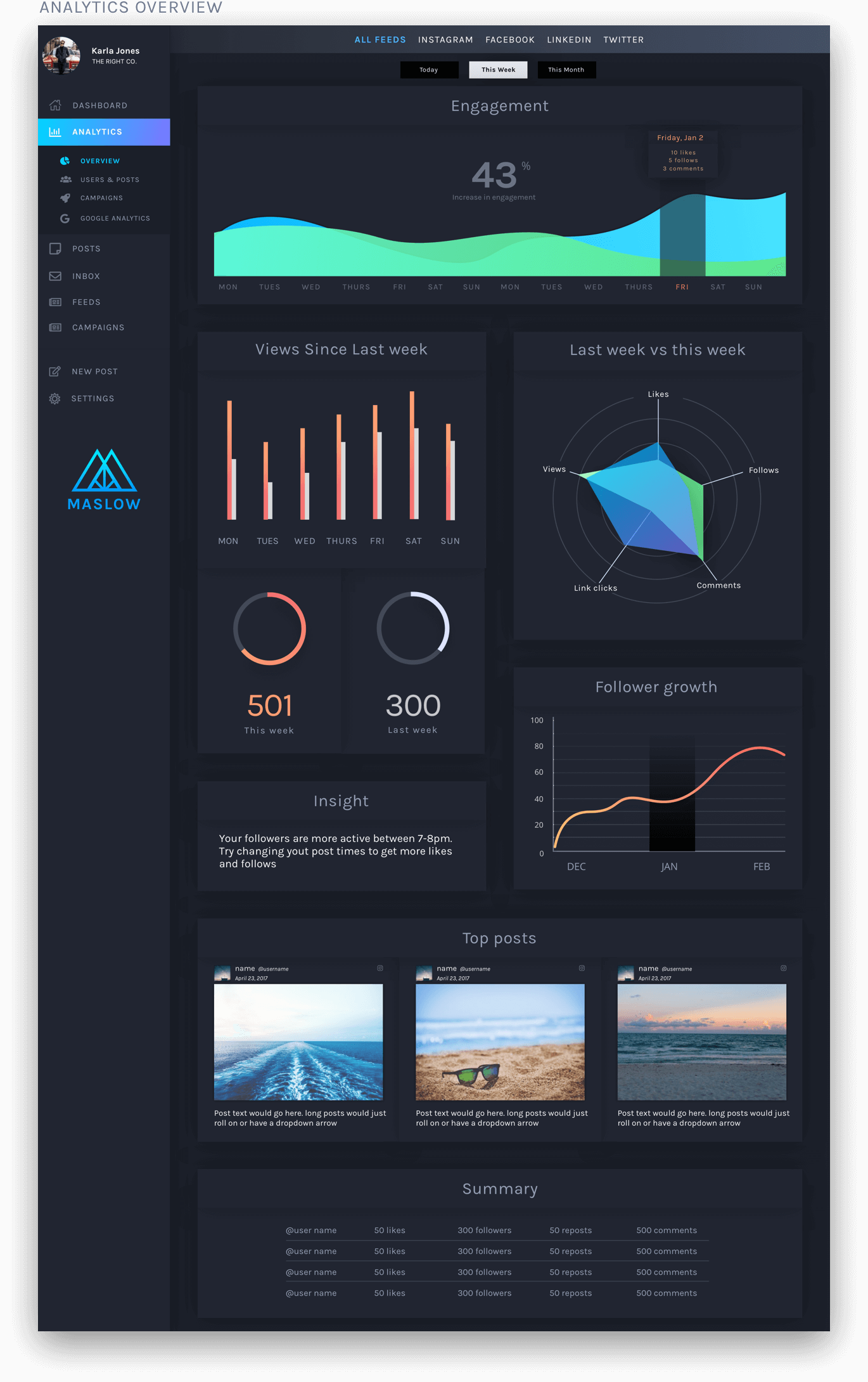
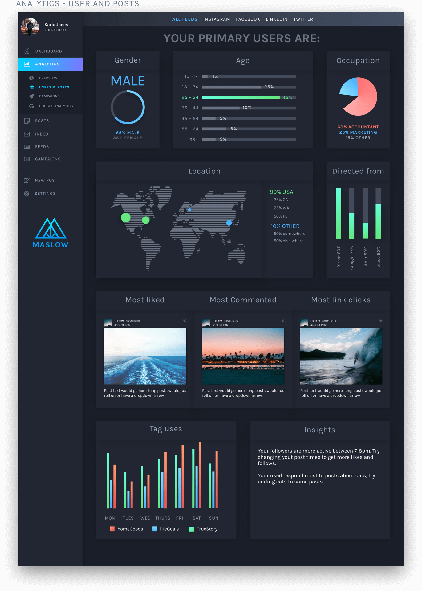
- 2. It may be tough to pull the analytics from each account making it hard to track/monitor post success and retweets.
- 3. it can be difficult to schedule posts and then edit them for each network.
Insights
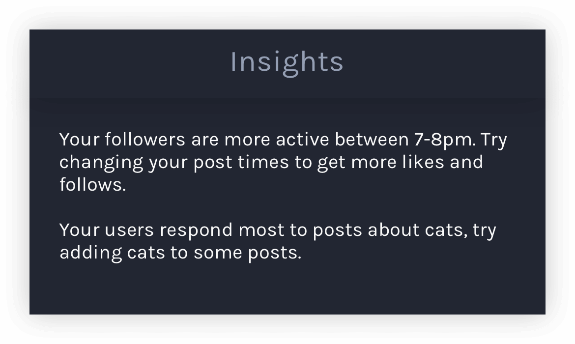
People want to know who is looking at their posts and who is clicking on their links. They wish to curate posts that better engage with their followers.
Solutions
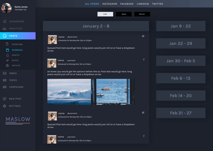
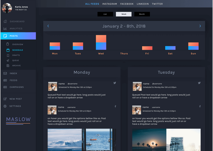
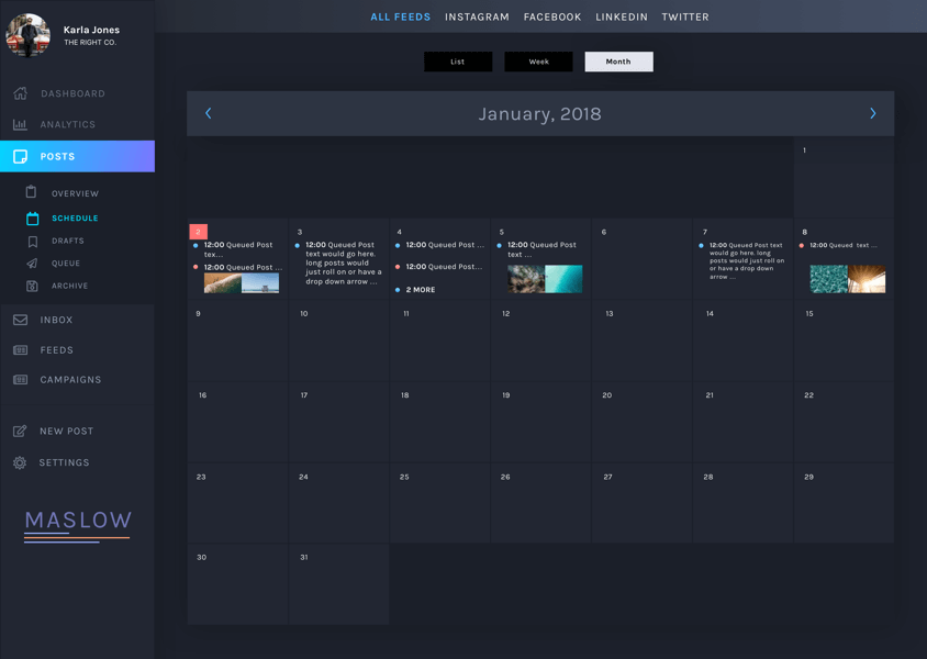
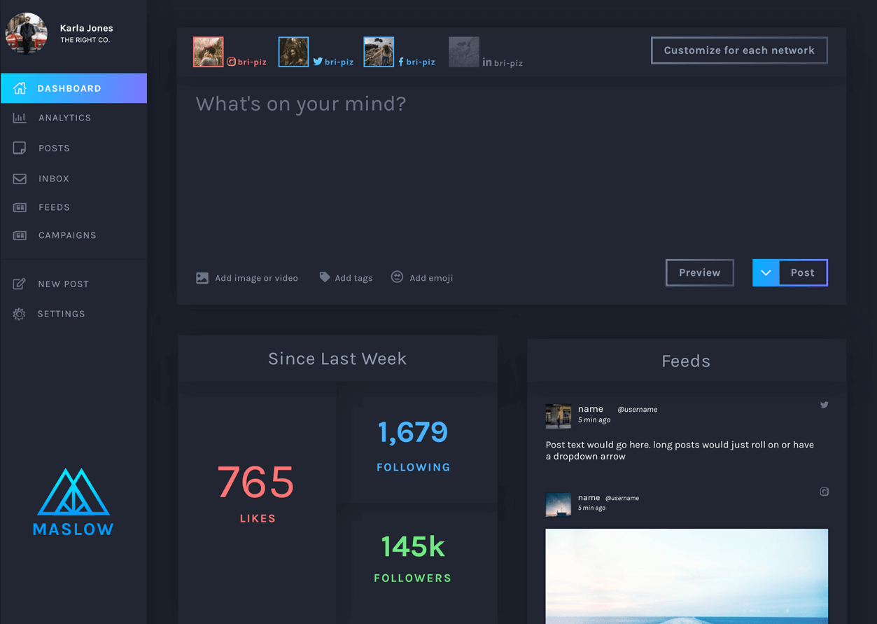
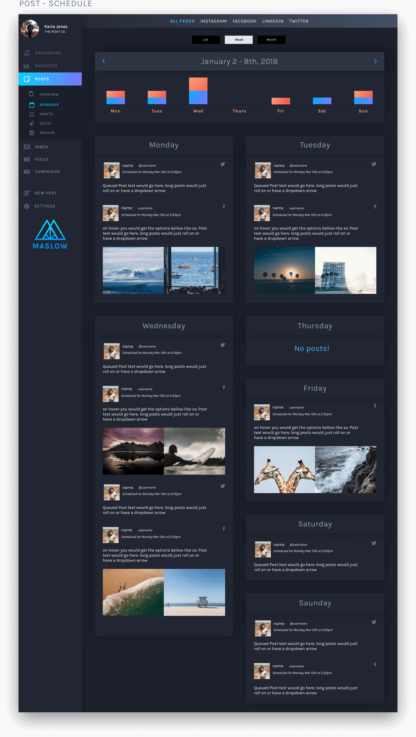
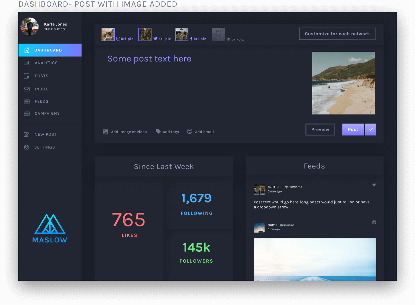
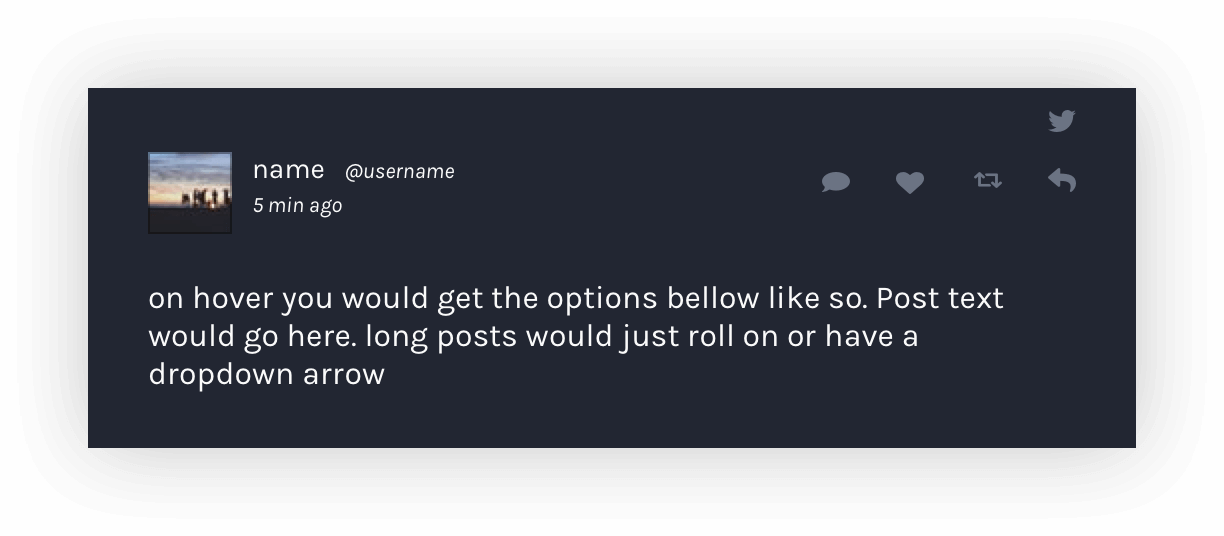
- 1. Introduce a clean feeds screen.
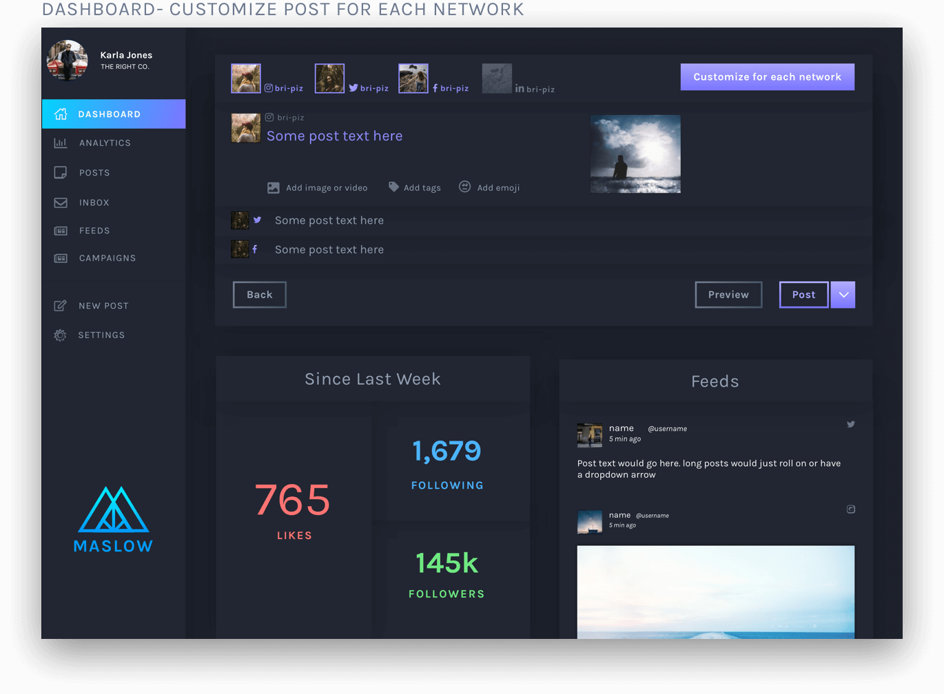
- 2. create simple flow for posting to multiple social media sites and edit each.
- 3. make tags easier to utilize.
- 4. create a clean scheduler.